Archive for the culture & media design Category

Computers are already visual, we just forgot

Posted in culture & media design, tools on January 8, 2014 by visualraccoon

“No, no, you don’t understand! Computers are basically about binary numbers and then we program them by putting layers on top of the raw binary to finally display text and visual images.”

Bullshit. Computers are really about spatial patterns of voltage storing elements which we then interpret as bits in the binary system.

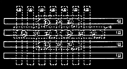
When a computer is designed, somewhere some guy has a big chart on his wall showing the mapping from the spatial pattern into bits.

Which probably started out as a diagram on a white board which was erased many times before they had the bit storage elements far enough apart to prevent heat confounding.

cmos-screen-capture2

So the computer started out as an analog map on somebody’s wall.

Computers are inherently spatial and then we cover it up.

Digital “ones and zeros” are an abstraction! Just a way of interpreting spatial patterns of voltage differences. Probably goes back to Alan Turing and his machine. And the damn tape, so easy to interpret in the bitwise way (great work on Enigma, Al, but the tape is crap).

Imagine instead if back at that crucial time in history someone had used the far more powerful* and already positional lambda calculus of Alonzo Church to directly interpret the spatial patterns and compute with them.

Then computers would also be usefully and overtly analog computers. That is, electrical computers would be analog computers (which they already are (so deep is the mis-thinking it perverts the very terms of our discourse)).

If only. And then you wouldn’t have to be reading this silly diatribe. And visual thinkers wouldn’t exist in a world of pain when they try to use computers let alone program them.

1rule-h35

Q: OK, but is spatial the same as visual?

A: Well, close enough for a rant. You bet.

Consider a creature who can see into the infrared really really fast and really really small. That guy can watch the patterning of the bit storage elements in real time as they are read and written.

* Q: Since Church and Turing proved that the lambda calculus and turing machines are both universal computational engines, how can the lc be more powerful?

A: Usefully powerful to a human. Whenever someone says some system is “Turing-equivalent”, it means you don’t want to have to actually use it for anything.

Interdisciplinary Work –> good luck with that!

Posted in culture & media design, visual languages on August 23, 2013 by visualraccoon

Interdisciplinary work is like the weather: everybody talks about it, but nobody wants to go out in the lightning storm.

Scott Kim, more than anyone I know, has served his time in the rain, suffering often the slings and thunderbolts of outraged categories.

Fortunately for him he not only persevered but thrived and got his interdisciplinary PhD. And fortunately for us, he has written a pithy summary of the issues, with graphic marginalia. From page 10 of the Introduction to his Viewpoint Dissertation:

trans-space-w440-ht30

On interdisciplinary work

Curiously, the word interdisciplinary exists only as an adjective. There are disciplines, but no interdisciplines. It is as if interdisciplinary people must forever wander homelessly. Thinking further about the nature of interdisciplinary work, I realized that the word “interdisciplinary” has several shades of meanings.

trans-space-w440-ht30
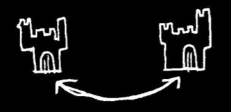
int-discpl-castles
Castles. Disciplines are private, walled kingdoms sitting on neighboring hills. Occasionally, bilingual messengers carry news from one kingdom to another. The walls were originally built to defend territories. Nowadays kingdoms grudgingly accept that they must coexist.

trans-space-w440-ht30
int-discpl-cracks
Cracks. The world of knowledge is cut up into categories. Categories bring a sense of order and stability to an otherwise chaotic world. Some people don’t fit the categories, but instead fall between the cracks. For them we invent a new category: people who can’t be categorized.

trans-space-w440-ht30
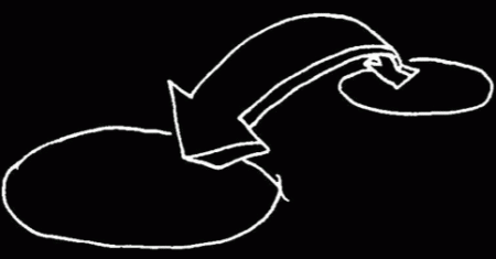
int-discpl-bridge-builder
Bridge-builder. Disciplines are islands separated by the sea of ignorance. Interdisciplinary people build bridges between islands so that others may cross. Without such bridges, passage between islands is difficult. One day, perhaps, all islands will be connected.

trans-space-w440-ht30

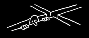
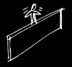
int-discpl-fence

Fence-sitter. The boundaries between disciplines are marked by fences. Without such fences, we could never tell who owned what territory. Each person must decide where he or she belongs. Interdisciplinary people sit on the fence, never deciding which side to commit to.

trans-space-w440-ht30int-discpl-hats

Hats. Throughout the day, we all play many different roles: parent, child, teacher, student, worker, friend, creator, performer, viewer. Each role comes with its own hat. Interdisciplinary people wear several hats at once. Too many hats make balancing difficult.

trans-space-w440-ht30

Viewpoint. I named my project “Viewpoint” as a reminder of the subjective nature of perception. There is only one world, but many ways to view it. Different frames lead to different interpretations. Interdisciplinary people are able to switch points of view.

Differing viewpoints exist not only between disciplines but within disciplines. In computer science, a digital circuit designer views programming as a way of telling a computer what to do, where as a programmer views digital circuitry as a way of implementing an algorithm. In graphic design, a production artist views a design concept as way of figuring out what to do with tools, whereas a graphic designer views tools and techniques as ways of implementing a design.

trans-space-w440-ht30

All text and graphics © 2013 Scott Kim. All rights reserved.

The Viewpoint Thesis

Posted in culture & media design, visual languages on August 14, 2013 by visualraccoon

This is a visualraccoon Perspective on Scott Kim‘s very graphic and revolutionary exploration,

Viewpoint: Toward a Computer for Visual Thinkers

What would it be like to go back to visual first principles and take a fresh look at graphic user interfaces?

The Viewpoint Thesis is that a small number of pixel manipulation primitives can be defined such that if they are bound to keyboard and mouse actions it is then possible to build a simple text-graphic editor by drawing it, and that that editor can be used to draw-build itself.*

The Viewpoint Thesis & Editor is part of a larger project founded on the hypothesis that:

“Only by treating the screen itself as a first class citizen will we be able to build computers that are truly for visual thinkers.” Scott, 1987.

This project includes building visual programming languages for such thinkers.

trans-space-w440-ht30
1rule-h35

* Full disclosure: “The Viewpoint Thesis” phrase and definition were made up by the raccoon and are not necessarily endorsed by Dr. Kim; the contents of this page have not been reviewed nor approved by Dr. Kim.

Here is Scott’s own introduction to Viewpoint, with historical context and a link to his PhD dissertation.

And let me repeat: this work is not merely disruptive, it’s revolutionary. When you have bacon and eggs for breakfast, the chicken was disrupted, but the pig was revolutionized.

Oh, a little too graphic for ya? Exactly!

“Graphic: Precisely and clearly expressed, leaving nothing to implication. Opposite of {implicit}.” from The Collaborative International Dictionary of English v.0.48 (gcide)

trans-space-w440-ht30

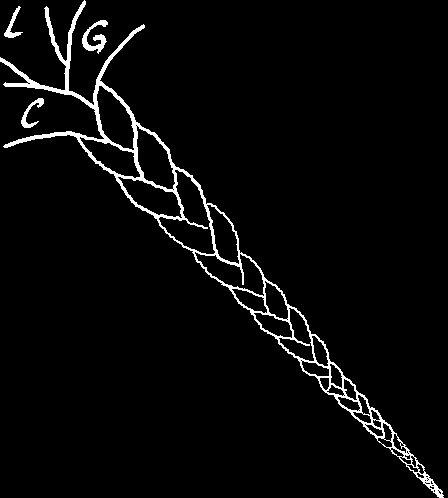
viewpoint-long-golden-cable-img-01

If you think that Logic, Graphics, and Computing should not play together, let alone be intimate, then this aggressively interdisciplinary dissertation may not be for you.

However, if you find LGC — the Long Glorious Cord — to be inherently interesting, then read on and enjoy.

“It’s graphics, Jim, but not as we know it.”

World without guitars

Posted in culture & media design, tools on June 19, 2012 by visualraccoon

World Without Guitars is just like our world, only guitars (and related string instruments) were never invented. It serves as a control reality for those undertaking the physical design of new instruments. And also as a cautionary tale for those tackling the necessary concomitant social engineering in order to bring about the cultural acceptance of a new instrument.

Our hero Guitar Boy is visited in a dream by the inter-dimensional ghost of Stevie Ray Vaughn. GBoy is a superb craftsman/electronics guy, and so he makes a Strat-like guitar (yes, and amp to go with it, OK?). Then he shows off his new instrument at MakerFaire. Of course, he can’t actually play it himself beyond plucking at a string and getting a note. Or, occasionally, he remembers the one chord ghost SRV taught him, which brings his left hand into play to modulate the effect of a pluck. Not real impressive, but a totally convincing demo in the eyes (and ears) of GBoy. He’s ecstatic, and very hopeful to boot.

Now he knows plucking a note isn’t the same as the music he heard SRV play in his dream, but he assumes if passersby have heard one note, then they will be able to imagine more than one, and played in a pleasing sequence.  He assures them, “Oh, don’t worry, people will be able to learn to play it really fast, and the result will be wonderful!”

Ha.

No deal. No one is buying.

It doesn’t matter what he says, nor how pretty the so-called ‘guitar’ he made is, he always gets the same reaction: “No one would be able to play that thing.”

“No human could ever learn,” they go on, “to play that ‘guitar’ in the way you describe, coordinating the so-called ‘chording hand’ with the ‘picking hand.’ And doing that ‘picking’ at the rate of five or ten notes per second? Are you insane? People’s hands and brains just don’t work that way.

“Besides, even if they could, why would they want to? The music you describe sounds hideous.”

Finally, if all that weren’t enough, there is one other problem with this ‘guitar’ that GBoy has invented. It’s made of the wrong stuff. When pushed, a surprising number of people reveal an innate prejudice against the basic technology of the instrument itself.

“Sorry, but I just hate wire and wood,” they say.

trans-space-w440-ht30

2rule-close-wonb

Footnote 1. Reason for ‘wire and wood’ phobia in World Without Guitars:

WWG is mostly just like our world, sans guitars, but it does differ in other minor ways. For instance, a lot more of the land is similar to Texas, with vast open plains and lots of cattle. Thus everyone has bad childhood memories of being abused by barb wire on wooden poles (and also a default state of kinda cranky counta there’s no SRV, one of the really good things about our Texas).

So horrible are these memories that they shrink back in terror when presented with an instrument made out of wire and wood (similar to the way many people in our world react when ‘confronted’ with a computer-based instrument). They can’t imagine a non-hostile use for something made of that shit, let alone doing art with it. “Are you kidding? You f***ing pervert!” they yell. Then more yelling, torches and pitchforks ensue.RIP Guitar Boy’s vision of a new art form based on a new instrument.

trans-space-w440-ht30

1rule-h15

Footnote 2. Improvisation may be tough even in a world with guitars:

More bad news, folks: improvised music proved impossible.

trans-space-w440-ht30

LoopyCam

Posted in culture & media design, performing graphics, tools on April 29, 2012 by visualraccoon

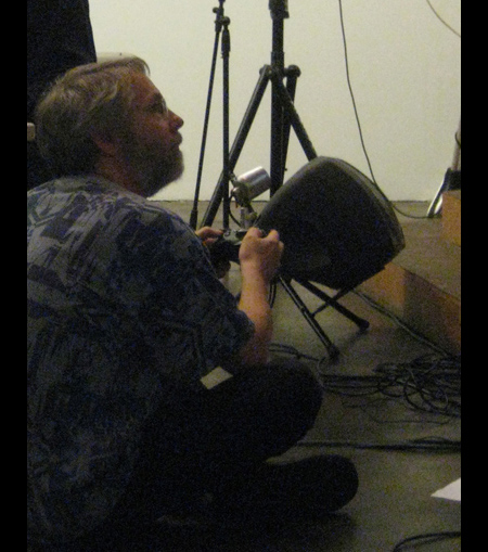
LoopyCam is a visual performance instrument designed for improvisation.*

But the improvisation is of a very unusual kind — it is improviation of context not content. The content is taken from the immediate environment by the loopycam artist and then re-presented on a large video screen in front of the audience.

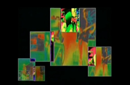
In that re-presentation, the LoopyCam artist modifies the video image in realtime using the vocabulary of both cinematography and video editing. This combination makes available traditional effects like cut, pan, and zoom — plus many other effects unique to the LoopyCam. For instance, moving, resizing, and overlapping of mulitple constantly-looping video clips (hence, LoopyCam).

And, these improvised modifications are often done in time to the music — that is, they can be done so quickly as to keep the beat.

Or as Tim puts it, “The low latency of LoopyCam allows the artist to align visual transitions and loop lengths with the music, and also with the movement of dancers.” **


Tim sits stage front to capture and re-present the action at SubZERO 2010.

Conceptual Overview of the major LoopyCam controls***

Videos

Tim on LoopyCam accompanying Rick and Bill Walker
at the SubZERO 2010 Looping Lounge

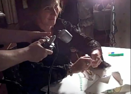
Leslie jams with Tim for the justly famous paper crumpling riff

Technical details http://loopycam.com

Other

Live drawing can also be a source of environmental content for LoopyCam.

*Yeah, I know — all visual instruments should be so designed, right?! Yet in fact very few are <sigh>.

Tim would want me to tell you that the instrument pictured above is in fact LoopyCam1 and that there is now a new improved LoopyCam2, see http://loopycam.com .

** Tim goes on to explain, “The low operational latency (the time between pressing control buttons and seeing their visual effect) allows the artist to precisely control visual transitions and loop lengths in order to match the timing of the music.”

*** NOTE: This controls diagram is only conceptual , to give a general idea of operating LoopyCam. The diagram shows a subset of the approximately 30 moves available, and Tim would probably disagree that the ones I have shown are “major.”

Space Palette — A New Instrument for Music and Visuals

Posted in culture & media design, performing graphics, tools on April 27, 2012 by visualraccoon


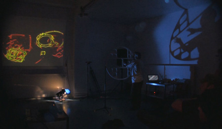
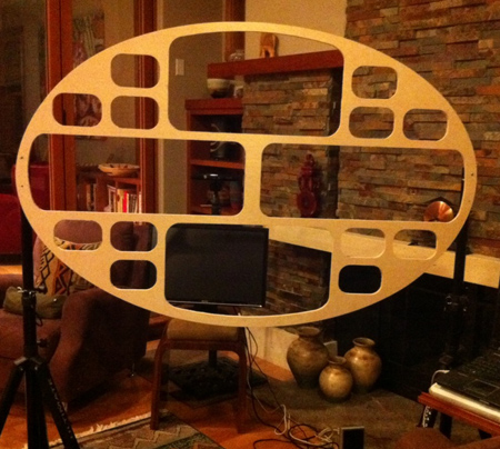
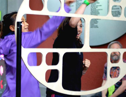
Space Palette performance at STEIM in Amsterdam April 2012

Conceptual Overview of how hand motions in the holes control music and graphics*

Full disclosure:

The original idea and intial sketch for the oval space frame design by the raccoon.

This is only a fan page; the official Space Palette home page is
http://spacepalette.com (natch’)

“Space Palette” is a trademark of Nosuch Media

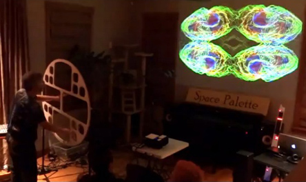
Video from House Concert, San Jose, Feb 2012


Space Palette at Sea of Dreams, New Years 2012


The well-lit SP relaxing at home


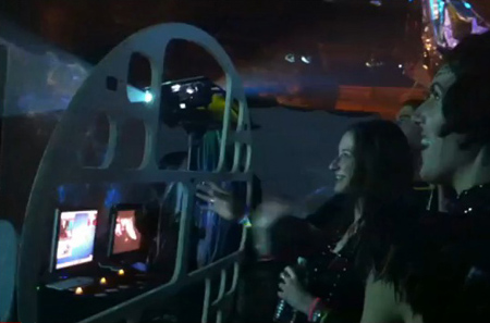
For Tim, performing on the SP is the next best thing to watching others enjoy it (photographed by Rachael Torres).

*NOTE: The control diagram is only conceptual, to give a general idea of correlation between hand motions and music/graphics output. For example, in the current instantiation, graphics controls are overlaid onto the major music controls, so that one hand motion in a large hole will generate both music and graphics.

Improvised music proved impossible

Posted in culture & media design, performing graphics, tools on April 22, 2012 by visualraccoon

A couple of years ago the raccoon was asked to chair a panel on “New Media.” The speakers were all amazing and gifted hacker/artists. To chair such a group was a real and unexpected honor (and, I screwed it up; more on that later).

To start things off and incline the tone of the panel in the direction of my obsession — the performing of live visuals — I enthusiastically proclaimed and promoted the idea of “Blues Graphics.” “You know,” I said, “visuals improvised live like Stevie Ray Vaughn playing the guitar.” The phrase had sounded so good to me the day before, screening well in my mind’s eye (the same display on which also appears footage from the imaginary Veli’s Graphics Bar in West Oakland). So I used the chairguy’s one minute intro to play SRV’s version of “Mary Had a Little Lamb” while at the same time showing a moving montage of the outside of Veli’s. Thus setting the scene for joy and sharing.

Well, as it turned out, for me, not so much.

But first, the panel itself went well, and all panelists did outstanding presentation/demos.

However, afterwards, while standing around in post-panel conversation, I was informed that improvising graphics ala SRV on guitar was simply not possible because, “The parameter space is too large to map onto the control space.”

Yikes. How embarrassing for me.

And I didn’t even know exactly what that sentence meant. But it was delivered with such authority that I was paralyzed in cognitive thrall, stammering some response I don’t even remember. Then I slunk away to lick my cerebral fissures and contemplate the errors of my visually obsessive ways.

But later that day, far from the crowd and upon reflection, I realized that the slogan & dictum was bullshit.

Here’s the proof: simply substitute a well known human activity, musical performance, for visual performance. With good ol’ SRV as my counter example.

Because, see, you could say exactly the same thing about musical performance. First, think of all possible sounds, and then consider the possibility of designing some kind of instrument to make them. Pretty hard, huh? Among the many problems is the large number of parameters to control that incredible variety of sounds. Pretty big space, right?

But then some bozo comes along and says he wants to make that instrument, and then proposes to play it in real time, maybe even improvising with it.

You would have to tell him, “I’m sorry, but such a performance is not possible because the parameter space is too large to map onto the control space.”

End of discussion.

Good thing you were there to clue him in, saved him a lot of trouble.

Nor can bumble bees fly.

So, here’s why music can be improvised:

Indeed, the space of all sounds, it’s a large parameter space. And let’s throw in more parameters, timing. How many ways are there to sequence and sustain sounds over time? Double yow. But, I hadda throw in time, cause that’s where performances take place.

However, look folks, we’re simply talking frameworks here. They restrict and limit possibilities to enable creativity. Inventing within constraints, art is painting with restrictions, blah blah blah

So we can use the Western diatonic scale to trim that infinite sound space, and on temporality impose time signatures. Narrows things a lot. And then invent an instrument which further narrows the possible sounds, and which maps the result on a control space (strings and frets, say). In fact, the guitar is exactly a working model of how to map the trimmed parameter space onto a playable control space.

Bumble bees can fly, and visuals can be improvised without need of randomization or algorithmic slaves.

Visual SRV lives!

Dancing about architecture: What a good idea!

Posted in culture & media design, performing graphics, tools on April 9, 2012 by visualraccoon

Ghandi was once asked what he thought of Western Civlization. He replied, “I think it would be a good idea.”

So, dancing about architecture, let’s go for it.

Why not use the Space Palette as an input device for AutoCAD … oooo, “Spatial” Palette, cool!

Which is the point of the last chapter in Live Graphics Nightly: all text-graphic media for live performance have more in common than differentiating; fine art or applied art is a later distinction of use, not an a priori essential property of a medium (fiddles and violins).

=============================================

Of course, usually this famous saying is used in its various forms as a put down for media-mismatches.

A common version: “Writing about music is like dancing about architecture.”

FYI, first use apparently in 1918

Strictly considered, writing about music is as illogical as singing about economics. All the other arts can be talked about in the terms of ordinary life and experience. A poem, a statue, a painting or a play is a representation of somebody or something, and can be measurably described (the purely aesthetic values aside) by describing what it represents.

From: http://quoteinvestigator.com/2010/11/08/writing-about-music/

who goes on to say

“In 1921 the remark reappears in the form of a sphinxlike simile. The format of the comment uses the word “like” once and the word “about” twice. This conforms to the most common modern template.

Writing about music is like ____ about ____.

“The first slot contains terms like dancing, singing, or knitting and the second slot contains terms like architecture, economics, or football.”

So now you can generate your own!

3, no 4 … nah, it’s only Three Dimensions of Visual Performance

Posted in culture & media design, performing graphics, tools on April 7, 2012 by visualraccoon

Or, how to avoid “vuzak fatigue” = the audience ignoring the visuals.

This is a followup to a discussion last summer between myself, Tim Thompson, and David Tristram. David got things started by defining the problem:

dt> The audience ignoring the visuals. This is central to my frustration with visual performance and must be solved if we are to succeed.

My response was to dig up my old PIPs metric for visual performance. I claimed that one reason audiences preferring the triggering and mixing of pre-recorded visuals (common “VJ” style), or synchronous computer generated images (algorithmic slaves, “music visualizer” style), was because the manual performers were several orders of magnitude too slow to be interesting in a purely generative schema. Compared for instance with musicians and other fast input performers.

dt> PIPS is useful but is a very narrow metric.

Well, David is right, PIPs is a very narrow metric — by itself. But, when you add two other narrow metrics, then you get … narrowness compounded? Or, if lucky, a rigid framework which is useful just because it is definable. When I got my degree in rat psychology, I learned that measureable rigid frameworks have their uses, if only to clearly define where you don’t want to go. They can also provide a place to stand from which to get a clearer view of where you do want to go.

In that spirit, I say that, yes, PIPs by itself is a sterile metric, but when you add in AG and MP, then those three axises together define a useful space for visual performance. Or in less grandiose terms, a few things to keep in mind when designing, composing for, and performing with visual instruments.

The axises are Performer Inputs per Second (PIPs) with Air Guitarabilty (AG) in a visual system that has Mistake Potential (MP).

This works as follows:

You have a visual performer initiating very frequent actions (PIPs) which gives enough temporal density to weave engaging graphical patterns in realtime, and the audience knows she’s doing it thanks to AG (Air Guitarability, the visible correlation between performer body movements and changes in the visuals), all within a conventional temporal structure so there can be flow, expectation, surprise, and mistakes (MP).

By “conventional,” I don’t necessary mean old traditions; I simply mean conventions whether new or old which establish structure for the performance. Call it dynamic visual vocabulary, call it time signatures for visuals, call it late for dinner, whatever. Just so the audience has a chance to grok the rules for the visual temporal patterns you’ll be laying down.

Oh shit, there I’ve said it, “rules.” So be it. I’m just an old fart, conservative, straight-ahead, 12 bar graphics guy, so my viewpoint is a bit conventional (literally, conventions — I like ’em)

I think rule-breaking is great in artforms where there are established traditions to contrast with. Rule-breaking in live visual performance may be a bit premature, like making up a new language, not teaching it to anyone else, and then expecting people to appreciate the delightful ways in which you violate the syntax for extra poetic expressiveness. They won’t.

Oh yeah, and about the on-again off-again Visual Richness dimension. Originally not there, then yesterday I thought I needed it and so put it back in. But then I realized (again, apparently!) that Visual Richness is secondary, an epiphenomenon in the viewer’s perception generated by PIPs and MP. I claim that MP is only possible within a dynamic visual vocabulary of primtives, riffs, and time signatures. Such a visual system, like the music infrastructure (i.e. diatonic scale, notation, time signatures, etc), then supports the emergence of composition. And entertaining richness is simply good composition times speed. Otherwise it’s just visual noise (bad composition) or slow painting (come back when it’s done).

Finally, the excellent post by David that spawned this blog entry:


dt>
Date: Thu, 09 Jun 2011 08:44:16 -0700
From: David T
Subject: Re: "VISUAL MUSIC" a conversation

Excellent discussion fellow voyagers.

PIPS is useful but is a very narrow metric. I would posit a single mallet hit on a tubular bell performed at the correct instant can rival a Steve Vai solo. Or a haiku compared with "War and Peace". Or Cage strumming a piano harp with a feather. Or meeting someone's eyes. All summer in a day, or a moment.

The audience ignoring the visuals. This is central to my frustration with visual performance and must be solved if we are to succeed. It's the environment and expectations commonly associated with live performance that make it difficult to showcase visual performance. The solution is using an environment tailored to visual performance. We have them, key examples being movie theatres and opera.

For our smaller events, say like in Daev's garage, simple steps should be taken. Turn down the lights. Have the musicians face away from the audience and toward the screen. Have the video fall to black between compositions.

The above reveals my bias toward the artifact, not the act of creation. Ultimately, the experience of the observer is the critical event, and the main part of that happens between the screen and the observers eyes. However, personally, I am interested in visual (and musical) experiences that are not the same every time. That's why I like live music, and especially improvisational performers like the Dead. I believe live, improvisational, collaborative visual performance is exciting, beautiful, enlightening, and transformational.

Let's do some of that.
Performing graphics: Fine art or applied art?

Posted in culture & media design, performing graphics, tools on July 8, 2010 by visualraccoon

Don’t answer that question! (on advice of visual counsel)


There are certain distinctions dangerous to make. And certain questions that only solidify those dubious distinctions.

If you know that someone is using a computer to spontaneously generate images for a live audience, what exactly do you know?

Is there text?
Is there graphics?
Is there music?
Are there bar charts?

Is it for fun?
Is it for profit?
Could it be for both?

Will the material be on the final exam?

Are you enthralled or bored out of your skull?


It’s time to stop drawing permanent lines of demarcation for no purpose. They will only bite you in the butt later on.


As the raccoon once told an audience in Japan, “beware of Westerners bearing distinctions”.

Text vs Graphic
General vs Special
Group vs Individual
Beginner vs Expert
Social vs Technological

and now

Fine Art versus Applied Art


The sooner we stop trying to make these distinctions — trying to make them once and for all, permanently, applicable in every situation — and instead see them as contextual decisions of local practicality, then the sooner we can enjoy the cross-fertilization of dancing over boundaries.

Wouldn’t you like to be one of the folks boogying in the back because you were so moved by the content and the spirit of the live imagery?

The group’s ideas at the Tuesday afternoon meeting never looked so good.

For a good overview of the very fine applied art of performing graphics in service of group communication, see Lynn Kearny’s site.

And for a complete trampling under dancing feet of the dubious and dangerous fine/applied distinction, see the last chapter of Live Graphics Nightly.


Content on Visual Raccoon is licensed under a Creative Commons by-nc-sa 3.0 United States License unless otherwise indicated. Comments, both text and graphics, are property of the commenters.